


Email Marketing
Published:
Email Marketing
Qasim Farooq
Share

You open your email marketing dashboard and—bam—it hits you. Graphs everywhere. Numbers flashing. Open rates here, bounce rates there, something called “CTOR” front and center, and wait… why is your unsubscribe rate trending upward?
Everything’s color-coded. Everything feels urgent. And somehow, none of it tells you what you actually need to know.
Sound familiar?
If you’ve ever found yourself staring at your dashboard wondering, Which of these metrics actually matter?—you’re not alone. It’s easy to fall into the trap of tracking everything just because it’s available. But more data doesn’t always mean better decisions. In fact, it often means spending more time reporting than actually improving your email marketing strategy.
Focusing on the wrong numbers can lead to stalled campaigns, wasted time, and strategies built on vanity metrics that look nice in reports but do nothing for your bottom line.
In this post, we’re cutting through the chaos.
You’ll learn which email marketing metrics are actually worth your attention, which ones are just noise, and how to build dashboards that help you move the needle—without the daily data spiral.
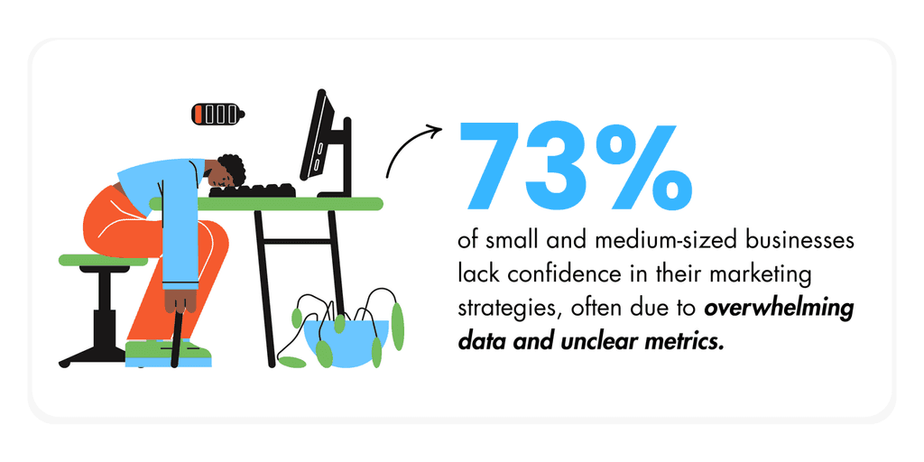
You’re Drowning in Data but Starving for Results—This Is for You
You’ve Got Dashboards for Everything—Why Isn’t Anything Working?
You’ve built out email marketing dashboards, set up your analytics tools, and every campaign is tracked across half a dozen web analytics dashboards.
On paper, everything looks “under control.” You’ve got dashboards for every marketing channel, heatmaps, traffic sources, real-time insights—even custom SEO dashboards that sync with social platforms.
So why isn’t anything moving?
Here’s the problem: when your entire digital marketing strategy runs on dozens of micro-metrics, you start mistaking movement for momentum. You’re tracking open rates, click-through rates, deliverability, CTOR, time-of-day performance—sometimes all on the same screen.
You feel informed. But that feeling doesn’t always lead to informed decisions.
This is the illusion of control. The more numbers you see, the more you assume you’re catching everything. But most email marketing efforts don’t fail due to lack of data—they fail because teams chase the wrong signals. And while you’re knee-deep in engagement metrics and campaign performance graphs, the real outcome—the conversion—is nowhere to be found.
Also, let’s be honest: checking your email marketing dashboard five times a day isn’t helping your pipeline. It’s slowing you down.
That constant data refresh becomes a distraction from actual execution. And if the goal is to generate leads, boost revenue, and improve email marketing performance—not just admire your marketing dashboard template—then it’s time to shift focus.
Common Signs You’re Stuck in Dashboard Purgatory
If your marketing dashboard feels like a high-maintenance pet that demands your attention but never really gives anything back, you might be stuck in what we’ll call dashboard purgatory.
Here are a few red flags:
High open rates, low conversions
Your email campaigns are getting opened… but then what? If you’re tracking opens and CTR but your conversion rate remains flat, something’s off. You're measuring interest, not intent.A/B testing fatigue with no real gains
You’ve tested subject lines, button colors, preview text—every week, something new. But the metrics barely budge. At some point, the test isn’t the issue—it’s what you're optimizing for.Your dashboard feels more important than your customer
If you’re spending more time inside your email marketing dashboards than talking to your team about user behavior, content strategy, or customer journeys—your priorities are upside down.
Many teams build out marketing dashboard templates with the best intentions: track, refine, repeat. But too often, those dashboards become performance theater—filled with campaign data that’s easy to measure but hard to act on.
The Metrics You Think Matter—And Why They’re Sabotaging You
CTOR Is a Trap (Sometimes)
Click-to-open rate (CTOR) sounds like a useful metric. After all, it tells you how many people who opened your email actually clicked. That has to be a good thing, right?
Not always.
Here's the issue: CTOR often misleads decision-makers into thinking a campaign is performing well, when it's really not moving the needle. A campaign with high CTOR but low conversions isn’t “working”—it’s just convincing people to browse, not buy.
Add to that the bots. Yep—security filters and bots are skewing open rates and inflating click-through rates. These automated interactions can make it seem like your email marketing campaign is blowing up when, in reality, it’s just noise. You’re not looking at genuine engagement; you’re watching scripts trigger false activity.
If your email marketing dashboard is reporting glowing CTR numbers, but your revenue generated from those emails is tanking, ask yourself: are we tracking email marketing performance—or just flattering ourselves with inflated numbers?
List Growth Means Nothing Without Behavioral Signals
Adding 1,000 new subscribers looks great in your marketing dashboard examples. But how many of those people are doing anything?
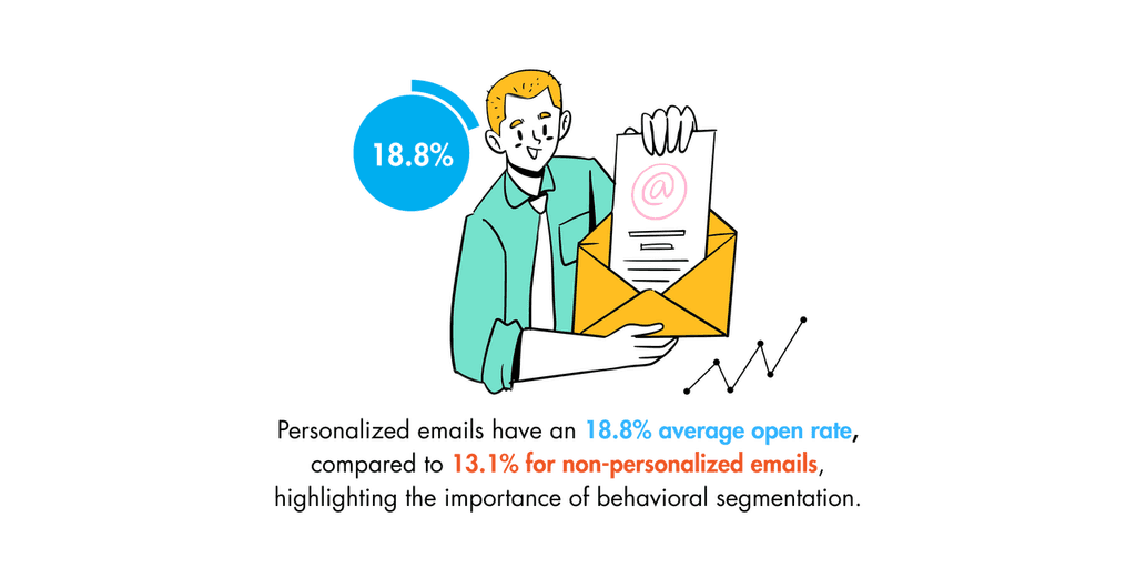
A big number in the “email list growth” column doesn’t tell you who’s actually opening, clicking, or converting. If your dashboard tracks total list size but ignores user behavior, you’re flying blind.
The real question isn’t how many people joined your list—it’s what are they doing now? Segmenting by signup date isn’t enough. You need to understand how subscribers interact with your campaigns over time. That means building dashboards that tie marketing campaign data to actions—scroll depth, site visits, repeat sessions, time spent on landing pages.
This is where web analytics dashboards and marketing dashboard templates with behavioral tagging come into play. Pairing campaign performance with behavioral triggers gives you a clearer view of who’s likely to convert—and who’s just collecting your emails.
“Deliverability Rate” Is Not a Victory Lap
Marketers love to brag about 99% deliverability. But here’s the truth: deliverability is just the starting line. Not the finish.
Getting into the inbox is baseline, not brilliance. It’s like saying, “Hey, our product made it to the shelf!” Cool. But did anyone buy it?
High deliverability rates don't guarantee visibility, let alone conversions. Your message may land in the inbox, but if it's buried under twenty others or immediately archived, does it even count?
Email marketing dashboards often prioritize deliverability because it's easy to track and looks good in reports. But focusing too much on that metric can give a false sense of success. Instead, focus on what happens after you land in the inbox—engagement, funnel movement, and yes, revenue generated.
If your performance dashboard starts and ends with “delivered,” you’re missing the bigger picture. It’s time to build smarter dashboards—ones that prioritize marketing performance, not vanity metrics.
Here’s What to Actually Track—If You Want Sales, Not Just Signals
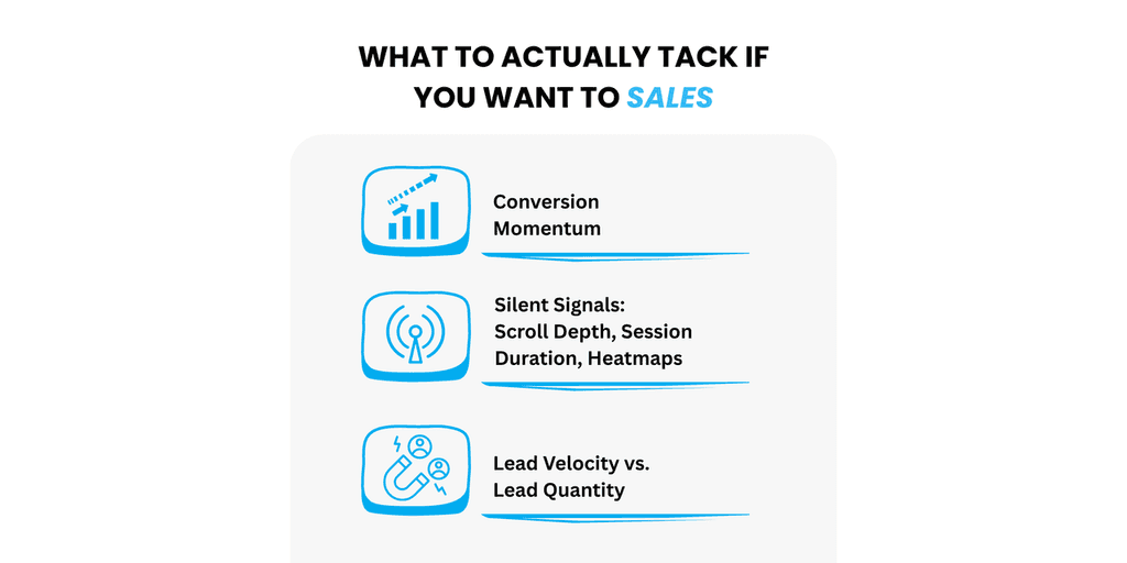
Conversion Momentum
Most dashboards make a lot of noise about what happened: open rates, clicks, unsubscribes. But if you’re trying to understand what actually works, you need to follow the trail—not just the breadcrumbs.
Conversion momentum is what separates campaigns that perform once from those that generate repeatable revenue. Instead of staring at isolated wins (“this one email got 300 clicks!”), look at what happens across the journey—first click, second open, third interaction, eventual purchase.
This is where multi-touch attribution stops being a buzzword and starts being useful. You’re not tracking vanity spikes. You’re tracking how a user moves through your email marketing campaigns. From welcome email to purchase confirmation—momentum matters.
If your email marketing dashboards can’t show that momentum, it’s time to rethink what you’re measuring. Otherwise, you’re just chasing peaks without ever building a climb.
Silent Signals: Scroll Depth, Session Duration, Heatmaps
Clicks are easy to track. They’re also easy to misread.
Real engagement hides in the things people don’t say—or in this case, don’t click. That’s why it’s worth paying attention to silent signals like scroll depth, time on page, and heatmaps.
If someone opens your email, clicks through, lands on your site… and then bounces in 10 seconds? That’s not a win. That’s a missed opportunity. You need to know what happens after the click.
By syncing your ESP with tools like GA4, Hotjar, or Mixpanel, you connect marketing data with actual behavior. You get to see how far people scroll, where they linger, what content keeps them around, and what sends them packing.
Your email marketing dashboard should reflect this. Not just click-through rates, but real engagement metrics that show who’s reading—and who’s just passing through.
Lead Velocity vs. Lead Quantity
Adding 1,000 new leads might look impressive on your marketing dashboard template. But if they’re just sitting there? Congrats—you’ve built a waiting room, not a funnel.
Lead velocity is what actually matters. It tells you how quickly someone moves from “new subscriber” to “customer.” And in many cases, fast movement is a better signal of fit than list size.
If leads are dragging through your funnel, piling up in one stage, or going cold after a few touches—that’s a velocity problem. One that your dashboard should call out clearly.
The fix? Build in velocity thresholds—time-based markers that help you see how long it usually takes a high-converting lead to move forward. If someone’s taking three times longer, you know something’s off.
Focus less on the size of your list and more on the speed of your funnel. That’s how you turn a marketing dashboard into a revenue engine.
Tactical Fixes to Clean Up Dashboard Overload
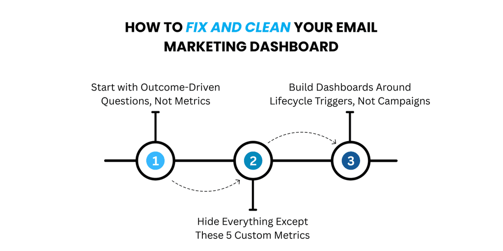
Start with Outcome-Driven Questions, Not Metrics
Before you add one more graph to your dashboard, stop and ask this:
What do I actually need to know to make a decision here?
That one question can cut through 90% of the clutter in most email marketing dashboards.
Too often, teams start with a metric—open rate, bounce rate, time of day—and build reporting around it. But unless you know what that metric helps you decide, it’s just noise.
Reframe how you build your performance dashboard. Let decisions drive your data, not the other way around. Whether it’s deciding if a campaign should be re-sent, tweaked, or tossed entirely—your dashboard should answer that fast.
If a metric doesn’t connect to a real business outcome, hide it.
Hide Everything Except These 5 Custom Metrics
Want a dashboard that works? Start by deleting 90% of it.
What you keep should be tied to actual outcomes. These five metrics are a solid place to start:
Revenue per email
Because clicks don’t pay the bills.Engagement score by segment
Not all audiences interact the same. This helps you track real differences between groups.Funnel drop-off by email stage
Know exactly where leads are ghosting you.Re-engagement success rate
Shows whether your win-back emails are doing more than just taking up space.Unsubscribe heatmapping
Track what sends people running—down to the subject line, time sent, or offer.
These aren’t vanity metrics. They’re essential metrics that help you measure what actually matters: money, movement, and message resonance. If your email marketing dashboard isn’t tracking these, it’s just taking up screen space.
Build Dashboards Around Lifecycle Triggers, Not Campaigns
If your dashboard is built around campaigns, you’re stuck in the past.
Customers don’t care that you just launched “Summer Sale Sequence 2.0.” They care about their journey. And your dashboard should reflect that.
Instead of tracking campaigns in isolation, shift to lifecycle-based reporting:
New lead
Nurtured
Active
Lapsed
Lost
Every stage has its own behaviors, its own signals, and its own triggers. A marketing dashboard built around lifecycle stages lets you track movement over time, not just activity in the moment.
It also makes it easier to identify trends, spot drop-offs, and adjust your strategy in real time—whether you’re tweaking email campaigns, optimizing lead generation, or refining your content strategy.
Campaigns come and go. Customer journeys evolve. Your dashboard should, too.
New Dashboard Approaches You Haven’t Tried Yet (But Should)
Predictive Engagement Scoring
There’s only so far you can get with open rates and click-through rates. Those numbers describe what already happened—not what’s likely to happen next. And when you're trying to build a smarter email marketing strategy, that lag matters.
Predictive engagement scoring flips that script. It looks at behavioral patterns across your email campaigns, web analytics dashboards, and past campaign data to predict what a subscriber is likely to do next. Are they warming up? Cooling off? Ready to buy?
These scoring models help marketing teams shift from reaction to anticipation—and allow for campaign triggers that are timed to actual intent.
Some email marketing platforms—like GoCustomer—include predictive scoring as part of their dashboard template, offering marketers a way to automate personalized follow-ups based on projected engagement, not just historical metrics. This kind of data-driven approach turns dashboards into action hubs, especially when you're trying to reduce customer acquisition cost while boosting engagement metrics in just a few clicks.
This isn’t about adding more graphs. It’s about surfacing the right insight, at the right time.
Segment Intent, Not Just Behavior
Your email campaign reports say a contact opened four emails. So what?
Open rates alone don’t equal interest—and clicks don’t guarantee buying intent. If you’re only segmenting based on behavior, you’re not seeing the full picture.
Start combining ESP data with CRM data—pulling together marketing dashboard metrics like opens, clicks, and sessions with pipeline signals from platforms like Salesforce or HubSpot. When you group based on intent clusters—patterns that reflect actual decision-making—you get more relevant segments.
Let’s say someone shows a high open rate, no clicks, but keeps logging into your app or site. That’s curiosity, not commitment. On a smarter email marketing dashboard, this cluster should be flagged for educational content—not pushed into a sales funnel.
Segmenting by intent helps align your content strategy with where people actually are in their journey. It improves targeting, reduces wasted marketing efforts, and leads to higher conversion rates across your email campaigns.
Composite Metrics: Build Your Own
If you’re measuring the same things everyone else is, don’t be surprised when your results look like everyone else’s.
Instead of relying on standard marketing dashboard examples, build composite metrics—custom formulas that actually reflect how your business works.
Here are two to start with:
Lead Energy = (recent opens + clicks) ÷ (days since signup)
Great for identifying subscribers whose attention is peaking.Funnel Friction = (emails opened) ÷ (sales conversion events)
Helps you spot inefficiencies in your funnel when you're sending a lot but converting a little.
These kinds of custom KPIs can be set up in tools like Looker Studio or Power BI, then visualized inside your performance dashboard. They offer a more meaningful way to identify trends, assess campaign data, and tie marketing efforts directly to revenue generated—not just to activity.
Composite metrics aren’t about adding more data—they’re about distilling what matters.
How to Know When It’s Time to Burn It All Down and Rebuild
The 3-Second Rule
Here’s a simple test for your current email marketing dashboard: open it, look at it for three seconds, and ask yourself—do I know what to do next?
If not, it’s broken.
The best dashboards give you direction, not confusion. Whether you're reviewing campaign performance, checking click-through rates, or trying to spot traffic sources, it should never take five minutes to find your next move.
If your dashboard feels more like a spreadsheet buffet than a decision tool, it’s time to rethink.
Are You Managing Metrics or Managing Outcomes?
There’s a difference between tracking everything… and improving anything.
If your day is spent updating widgets, sorting web analytics, tweaking your dashboard template, and reacting to fluctuations in engagement metrics—you’re managing metrics. Not outcomes.
Dashboards aren’t the goal. They’re a tool to help you reach business goals like growing your customer base, improving conversion rate, and reducing customer acquisition cost.
If your dashboard isn’t helping you make informed decisions, it’s not helping at all.
Dashboard Rot: When KPIs Don’t Evolve with Strategy
What you track should match how you grow.
But most marketing dashboards age poorly. They’re full of KPIs that made sense three quarters ago, but now sit untouched while your marketing channels, email campaigns, and lead generation efforts have completely shifted.
This is dashboard rot. And it happens when dashboards aren’t aligned with strategy.
If you’ve added new social platforms, launched paid advertising, or changed your audience targeting but your email marketing dashboards still track the same old open rates and CTRs, you’re flying with stale metrics.
You need a dashboard that adapts with your marketing strategy—not one stuck in last year’s roadmap.
Final Word: You Don’t Need a Bigger Dashboard—You Need a Better Strategy
Let’s be honest—at a certain point, more dashboards just mean more distractions.
You don’t need another tab tracking bounce rate. You don’t need another chart breaking down opens by time zone. What you need is a clear strategy for turning email marketing data into meaningful outcomes—and a system that makes that process faster, not harder.
Because here’s the thing: dashboards aren’t a solution on their own. They’re a reflection of what you choose to measure. And if you're tracking every available metric across your email campaigns, social media, and web traffic—without knowing which ones support your goals—you’re not enabling smarter decisions. You're enabling noise.
Bigger dashboards don’t drive growth. Smarter dashboards do.
What should that look like?
A dashboard that ties sales metrics to campaign strategy, not just opens and clicks.
A view of email campaigns performance across lifecycle stages, not just one campaign at a time.
Clear links between leads generated and lead conversions, so you know where your funnel’s strong—and where it’s leaking.
And it shouldn’t stop at email. When your social media dashboards, Google Ads, and even Bing Ads data live in silos, it’s hard to see the full picture. A modern marketing strategy connects these data sources and shows how they collectively support your email marketing efforts and revenue goals.
That’s where tools like GoCustomer can help—not by giving you more data, but by making the right data easier to act on. With clean visuals, predictive scoring, and outcome-first reporting, it’s focused on enabling marketers to make decisions that lead to more qualified leads, stronger content strategy, and better conversions.
And in a crowded market, clarity is a competitive advantage.
So if your current dashboard feels like a bloated spreadsheet trying to look helpful, it might be time to start over—not with more features, but with better focus.
Track less. Understand more. And build a strategy that tells you what’s working, what’s wasting time, and where to go next—in just a few clicks.
Because data doesn’t create results. Direction does.

Reach more customers with your cold emails
Table of Contents
In a nutshell
High open rates coupled with low conversions may indicate that while your subject lines are compelling, the email content or call-to-action (CTA) isn't resonating with recipients. It's essential to align your email content with your audience's expectations and ensure that the CTA is clear and persuasive.
Key metrics to consider are:
Open Rate: Indicates the percentage of recipients who opened your email.
Click-Through Rate (CTR): Measures the percentage who clicked on links within the email.
Conversion Rate: Tracks the percentage who completed a desired action post-click.
Bounce Rate: Shows the percentage of emails that couldn't be delivered.
Unsubscribe Rate: Reflects the percentage of recipients who opted out.
Artificial Intelligence (AI) can:
Predict recipient behavior, allowing for more personalized content.
Automate A/B testing to determine the most effective email elements.
Segment audiences based on behavior and preferences.
Optimize send times for maximum engagement.
Yes, integrating social media metrics provides a holistic view of your marketing efforts. By combining data from platforms like Facebook, Twitter, and LinkedIn with email metrics, you can better understand audience engagement across channels and refine your strategies accordingly.
Start by clearly defining your objectives, such as increasing sales, boosting engagement, or growing your subscriber list. Then, select metrics that directly measure progress toward these goals. Regularly assess and adjust your dashboard to reflect any changes in strategy or objectives.

Subscribe to our Newsletter!
Digital advice costs money but we send it to
your inbox for free.
Related Blogs

Time is Money, and We're About to Save You Both!
Book a quick demo of our email marketing tools and watch as we transform your leads into loyal customers.

![A loop illustration w-auto h-[70px]](/_next/image?url=%2F_next%2Fstatic%2Fmedia%2Fvector1.7738e6de.png&w=256&q=75 "GoCustomer Platform Image")

Get in touch
Subscribe to our weekly Newsletter and receive updates via email.